Dashboards are data visualizations that provide a quick and easy way to see how your business is doing. Unlike rows and rows of uninteresting data, they can help you quickly spot trends, track progress, and identify areas that need improvement. Dashboards are also a great way to share information with your team or clients. By displaying data in an easy-to-understand format, well-designed dashboards can help you glean insights to make strategic decisions and take meaningful action. If you’re not using dashboards, you’re missing out on a valuable tool for running your business.
To make awesome digital dashboards that get used, you should first understand what makes a great dashboard. At newData, we have identified 12 Golden Rules of Data Visualization:
- Define your target audience. A dashboard’s target audience depends on the users’ specific goals or needs. To create an effective dashboard, consider who will be using it and what information they need to glean from it. Executive dashboards are typically high-level summaries, while dashboards designed for managers tend to be deeper dives into the data.
- Clarify the purpose. The most important information you need to convey should jump out on a dashboard, much like a paragraph’s topic sentence. It should be easy to scan, so users can quickly find the information they’re seeking. For example, if the goal is to track corporate productivity, then the dashboard may include a large graph that highlights the company’s overall productivity over time.
- Provide supporting detail. Every element on the dashboard should support the main purpose. In our corporate productivity example, secondary or supportive information (such as a particular team’s or individual’s specific performance) can be shown in smaller graphs beneath the main graph.
- Make it timely. A dashboard’s data inputs should be updated regularly to ensure they stay relevant. For example, if the dashboard tracks sales data, then it should be updated daily or weekly to reflect the latest numbers.
- Keep data visualizations simple. Too many or over-complicated visualizations can make pretty pictures, but they can also be overwhelming and make it difficult for users to find what they want. Your target audience should understand any visual within just a few seconds. Studies have shown that in this digital age, most of us only have an eight-second attention span (and I would argue that the majority of executives have even less than that!). Users don’t care how brilliant the designer is; the less-complicated the explanation, the more likely they are to find it helpful.
- Choose appropriate dashboard elements. Charts and graphs are intended for different purposes. For example, if a dashboard’s purpose is to track website traffic, then it may include both a line graph of visitors over time and a pie chart that breaks down where the traffic is generated. A word to the wise, though: Choose graphs and charts carefully. Pie charts can get confusing if they have too many data points, and line graphs can be difficult to interpret if the data is too granular.
- Limit interactivity. While it may be tempting to make dashboard visualizations interactive, it’s important to limit interactivity to only absolutely necessary elements. Too much interactivity can be confusing and make the dashboard difficult to use.
- Make it visually appealing. A dashboard should be easy on the eyes, so users will actually want to use it. Keep graphs and charts in roughly the same place on each page, and make them a similar size and shape. Choose a simple color scheme and stick with it. It’s important to use visually-appealing colors that help convey the data’s key insights. (See our tips at the end of this post for choosing the right colors such as complementary, analogous, triadic, tetradic, or monochromatic color schemes.)
- Simplify the numbers. When displaying numbers on a dashboard, show users the most relevant data, not the less-important, intricate details. This approach will make it easier for the target audience to quickly understand and remember important information. For example, numbers should typically be rounded to the nearest whole number, and decimals should only be displayed if significant digits facilitate data interpretation.
- Maintain consistency. Consistency across dashboard elements enables users to quickly interpret and compare data. Strive for uniformity in the way you present and summarize insights (such as the information displayed on a chart’s X and Y axes, units of measurement, labels, and even formatting like text size and font).
- Provide context. Dashboard contents should be relevant to the narrative. Each chart or insight’s purpose should support a cohesive message. For example, simply displaying this year’s sales as $20,000 has no context. Have sales increased or decreased? To provide context, a line chart that shows sales over time would give users a sense of whether that sales number is good or bad.
- Measure your results. Always test your dashboard with the target audience before you launch it. Doing so will help ensure that the dashboard meets your users’ needs.
A good dashboard provides easy access to data and meaningful insights that spreadsheets simply can’t duplicate. It streamlines complex information and expresses the data’s meaning. It provides an intuitive user interface and is customized and personalized. What type of dashboard would be meaningful to your stakeholders? If you’re not sure, ask them! They probably have a good idea of what they need from your data reporting to make informed decisions. Once you know what they need, you can get started on designing that perfect dashboard for your business or organization.
APPENDIX – Color Selection Tips
Complementary colors: Complementary colors are opposite each other on the color wheel, which means they create a visually appealing contrast. Some examples of complementary colors are blue and orange, green and red, and purple and yellow.
Analogous colors: Analogous colors are closely related. For example, blue and green sit next to one another and represent a piece of the color wheel. Consider hues of red, pink, and purple or a collection of bright blues, greens, and turquoise. Because they are closely related, they tend to produce an overly-uniform, or monochromatic, appearance. When choosing wall colors for their homes, most people opt to use analogous color schemes because they appear balanced, serene, and neutral. Similarly, these are the most natural-looking color schemes that we encounter in nature. The most famous monochromatic design is a combination of blues, which we associate with water.
Tetradic or Monochromatic Colors: A tetradic color scheme is a variation of the twin color scheme in which four colors are equidistant from one another. All four hues are equally distributed around the color wheel, ensuring that no single hue has a stranglehold on the design. Because it makes use of four colors organized into two complementary color pairs, the tetradic (double complementary) plan is the most sophisticated. Tetrad is a very demanding color scheme; it needs careful planning and a passionate approach to interactions involving these hues. The scheme is difficult to balance—if all four hues are used in equal measures, the design may appear uneven; therefore, if you’re using this scheme you should choose one color to dominate the others.
Achieving Financial Equity
Imagine closing the racial, gender, and generational wealth gaps by 2040. Achieving this type of financial equity is the goal of Impart Media—a start-up with a noble cause. The company’s mission is to help people of all backgrounds build financial security by leveling the playing field through information. To this end, Impart created a Money Matters YouTube channel and the Hive Wealth app as alternative vehicles for providing relevant, guilt-free financial information. They believe everyone—regardless of race, age, or gender—should have access to the quality financial advice that was previously relegated to just a few.
Money: The Last Taboo
The topic of money should not cause shameful feelings. Both their YouTube channel and app provide useful financial information without making anyone feel embarrassed about where they currently are in their journey to improved financial decision-making. No longer are sound investment strategies accessible to only the wealthy (many of whom have amassed their fortunes intergenerationally via inheritance). Money matters to everyone, irrespective of who they are and their financial circumstances.
The Hive Wealth App
Before achieving improved financial performance, people must be able to baseline their wealth, or net worth (the amount left over after subtracting liabilities from assets). For example, from a generational point of view, it wouldn’t make sense for Gen X-ers to compare their net worth to Boomers, who have had more time to accumulate wealth.
Demographic differences in net worth exist not only among different generations, but also among different genders, races, and other demographics. The Hive Wealth app enables members to compare their financial situations across demographics and financial circumstances. The overarching objective, as previously stated, is to narrow the wealth gap by providing insight into what that gap looks like. To achieve this aim, however, we needed a reliable data source to benchmark performance that can be divided into different groups based on demographics, financial net worth, assets, and liabilities.
Identifying the Right Data
To identify the right data, we needed to understand what data was available, how it was organized, and how accurate it was. After some initial research, we decided on the Census Bureau’s Survey of Income and Program Participation (SIPP) as our data source. The SIPP provides detailed information on income, assets, and liabilities for a representative sample of US households. To give a sense of its depth and breadth, the SIPP data dictionary is more than 3,000 pages.
US Census: Survey of Income and Program Participation
The Survey of Income and Program Participation (SIPP) is an important information source that helps us understand the economic situation of people in the United States. It provides detailed information on income, taxes, assets, liabilities, and participation in government transfer programs. This data allows policymakers to evaluate federal, state, and local programs’ effectiveness.
The Department of Health, Education, and Welfare (HEW) developed SIPP in 1975. HEW spent the next five years collaborating with the Census bureau to test and develop a longitudinal survey, as part of the Income Survey Development Program. They conducted the first nationwide test of 2,000 homes in 1978, and in 1979, they interviewed a truly representative national sample of 8,200 households.
SIPP officially launched in October 1983, after the Census Bureau received funding that year which allowed work on SIPP to continue. The Bureau designed the survey to assess a national household sample, and they interviewed every person aged fifteen or older. Four months after the initial interview, respondents were surveyed again; this process was repeated over thirty-two months. Each February, they interviewed a new group of respondents, creating an overlapping series of survey panels. The Census Bureau revamped the SIPP in 1996 by conducting a single, larger panel over four years and interviewing respondents twelve to thirteen times per year. Additionally, they introduced computer-assisted interviewing (CAI), which expedited data processing and allowed for real-time answer accuracy checks. SIPP is one of the best and most comprehensive ways to assess typical Americans’ financial well-being.
Using Hive Segments to Benchmark
The Hive Wealth app categorizes its members into hives. The hives are broad at first, with two age-based categories: Generation X or older and Millennials or younger. The app then compares these members’ net worth information (a measure) to SIPP-provided data. Even though the hives were broad, this benchmark establishes a framework to baseline wealth. Just like a human cell that splits to create more cells, the hives will split based on other demographic criteria. To be sure, SIPP has a variety of demographics that can further refine the hive segments. The measurement data used to benchmark financial information initially only included net worth. However, because the net worth measure is calculated by subtracting total assets from total liabilities, those two groups could be used as benchmarks. Moreover, even these two measures can be broken down into more specific measures. Total assets, for example, include assets held at various financial institutions, the amount of money in stocks and mutual funds, and the value of any primary or secondary residences. Liabilities operate similarly; they may be divided into credit card debt, business loans, education debt, and so on.
Visualizing the Data
newData’s dashboard development services seemed like a logical place to start. The company offers a wide variety of options for data visualization using Microsoft Power BI as well as Salesforce Tableau and IBM Cognos. Unfortunately, weighing the data isn’t possible. The good news is that newData created a calculation using Power BI’s DAX programming language. Given survey design’s complexity, the newData team worked directly with an economist at the Census’ Labor Force Statistics Branch’s Social, Economic, and Housing Statistics Division to ensure that filters were applied correctly.
To ensure that the dashboard was accessible to business users, it was important to keep it simple. Therefore, the SIPP dashboard consisted of two pages:
- Main Page
- Cross Tabulation Page
Main Page (Example A)
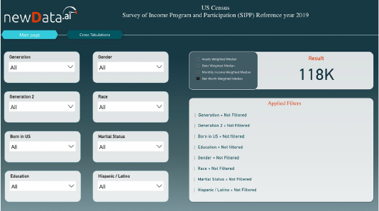
At the time of this writing, the dashboard consists of eight demographic dimensions and four measures. Each demographic element can be applied individually or jointly with other demographic elements. Moreover, the dashboard allows users to choose among four measures: Net Worth (Total Assets – Total Debt), Total Assets, Total Debt, and Monthly Income. Because of the large skews in financial data, the results were calculated using the median as the preferred statistic. Without any demographic filters applied, the median net worth for the 2019 reference period was $118K.
Main Page (Example B)
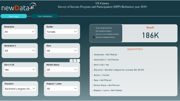
The above screenshot shows that the median net worth jumps to $186K when you apply three additional filters:
- Education: Bachelor’s degree
- Gender: Female
- Born in US: Yes
Cross-Tabulation Page
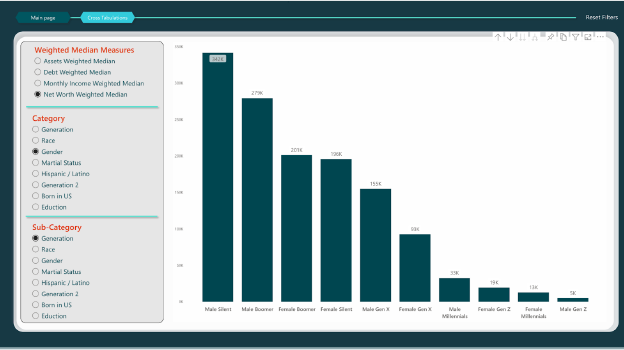
The dashboard is also capable of visually combining two demographics for each measure. The above screenshot illustrates two gender categories by four generational categories to determine net worth. Generating insights from the visualization is easy. For example, net worth is higher for every generation, with the exception of Gen Z, in which the female net worth is higher than the male net worth. This conclusion, however, may change as more Gen Z-ers are added to the SIPP survey.
Integrating the results
Helping Closing the Wealth Gap
newData used SIPP data to develop a dashboard for the Hive Wealth app using Power BI, an interactive data visualization software product Microsoft developed with a primary focus on business intelligence. The business objective was to enable Impart to benchmark its members’ net worth and other financial information across demographics and thereby allow its members to see how they were doing fiscally compared to similar Hive Wealth members.
Through the power of accurate information and sound advice, Impart Media is taking steps to close the wealth gap and create a more financially inclusive world.